Mastering Matplotlib for Effective Data Visualization
Introduction to Matplotlib: Your Gateway to Data Visualization in Python
If you’ve ever wanted to turn boring numbers into stunning visuals, Matplotlib is your best friend. Whether you’re a data scientist, engineer, or just someone who loves playing with data, Matplotlib is a must-have tool in your Python toolkit. In this guide, we’ll cover everything you need to know to get started with Matplotlib, from what it is to how to create your first plot. Let’s dive in!
What is Matplotlib?
Matplotlib is a Python library for creating static, animated, and interactive visualizations. Think of it as a blank canvas where you can draw anything from simple line graphs to complex 3D plots. It’s like the Photoshop of data visualization—powerful, flexible, and widely used.
Why Use Matplotlib?
- Powerful and Flexible: You can create almost any type of plot you can imagine.
- Widely Used: It’s the go-to library for data visualization in Python.
- Great for Beginners and Experts: Easy to learn but packed with advanced features.
- Integration: Works seamlessly with other Python libraries like NumPy, Pandas, and SciPy.
Real-World Applications of Matplotlib
- Business: Visualizing sales trends, revenue growth, or customer behavior.
- Science: Plotting experimental data, such as temperature changes over time.
- Finance: Analyzing stock prices and market trends.
- Machine Learning: Visualizing model performance, like accuracy and loss curves.
How to Install Matplotlib
Before you can start creating plots, you need to install Matplotlib. It’s super easy! Just open your terminal or command prompt and run:
pip install matplotlibIf you’re using Jupyter Notebook, you can install it directly in a cell:
!pip install matplotlibBasic Structure of Matplotlib
Matplotlib has two key components:
- pyplot Module: This is the main interface for creating plots. It’s like your paintbrush for drawing on the canvas.
-
Figure and Axes:
- Figure: Think of this as your canvas. It’s the entire space where your plots live.
- Axes: These are the individual plots on the canvas. A single figure can have multiple axes (subplots).
Your First Matplotlib Plot
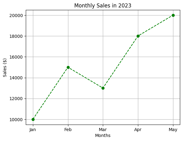
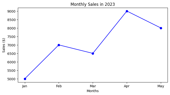
Let’s create a simple line plot to see how Matplotlib works. Imagine you’re tracking the monthly sales of a small business. Here’s how you can visualize it:
    import matplotlib.pyplot as plt

    # Data
    months = ["Jan", "Feb", "Mar", "Apr", "May"]
    sales = [10000, 15000, 13000, 18000, 20000]

    # Create a plot
    plt.plot(months, sales)

    # Add labels and title
    plt.title("Monthly Sales in 2023")
    plt.xlabel("Months")
    plt.ylabel("Sales ($)")

    # Show the plot
    plt.show()

Customizing Your Plot
Let’s make our plot more visually appealing:
    plt.plot(months, sales, color="green", linestyle="--", marker="o")
    plt.title("Monthly Sales in 2023")
    plt.xlabel("Months")
    plt.ylabel("Sales ($)")
    plt.grid(True)  # Add a grid for better readability
    plt.show()
Practice Exercise
Let’s put your new skills to the test! Here’s a small task for you:
    # Data
    days = ["Mon", "Tue", "Wed", "Thu", "Fri", "Sat", "Sun"]
    visitors = [200, 300, 250, 400, 350, 500, 450]

    # Create a plot
    plt.plot(days, visitors)
    plt.title("Website Visitors Over a Week")
    plt.xlabel("Days")
    plt.ylabel("Visitors")
    plt.grid(True)
    plt.show()

Conclusion
Congratulations! You’ve taken your first step into the world of Matplotlib. You’ve learned:
- What Matplotlib is and why it’s useful.
- How to install Matplotlib.
- The basic structure of Matplotlib (pyplot, Figure, and Axes).
- How to create and customize your first plot.
Your First Plot: Creating a Line Plot with Matplotlib
So, you’ve installed Matplotlib and are ready to create your first plot. Congratulations! In this guide, we’ll start with the simplest type of plot: the line plot. Whether you’re tracking sales, temperatures, or website traffic, line plots are a great way to visualize trends over time. Let’s get started!
What is a Line Plot?
A line plot is a type of graph that displays data points connected by straight lines. It’s perfect for showing how something changes over time or across categories. For example:
- Tracking monthly sales for a business.
- Visualizing temperature changes over a week.
- Plotting website traffic over days.
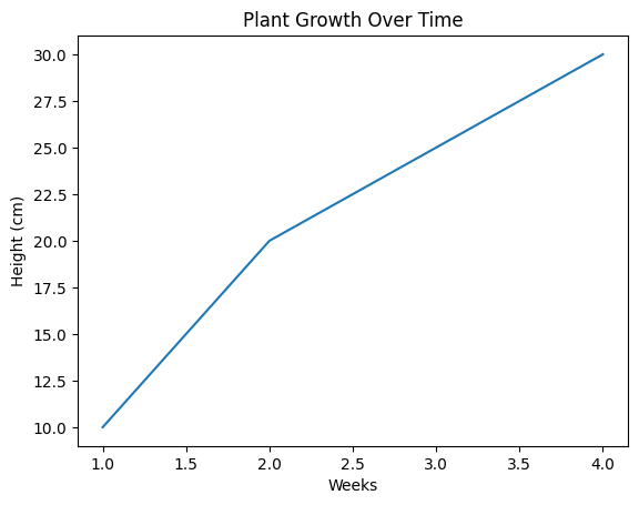
Creating Your First Line Plot
Let’s start with a simple example. Imagine you’re tracking the growth of a plant over four weeks. Here’s how you can visualize it using Matplotlib:
    import matplotlib.pyplot as plt

    # Data
    weeks = [1, 2, 3, 4]  # Weeks
    height = [10, 20, 25, 30]  # Height in cm

    # Create a line plot
    plt.plot(weeks, height)

    # Display the plot
    plt.show()
Understanding the Code
- import matplotlib.pyplot as plt: Imports the pyplot module with the alias
plt. - plt.plot(weeks, height): Creates a line plot with weeks on the X-axis and height on the Y-axis.
- plt.show(): Displays the plot.
Customizing Your Line Plot
Now that you’ve created a basic plot, let’s make it more informative and visually appealing.
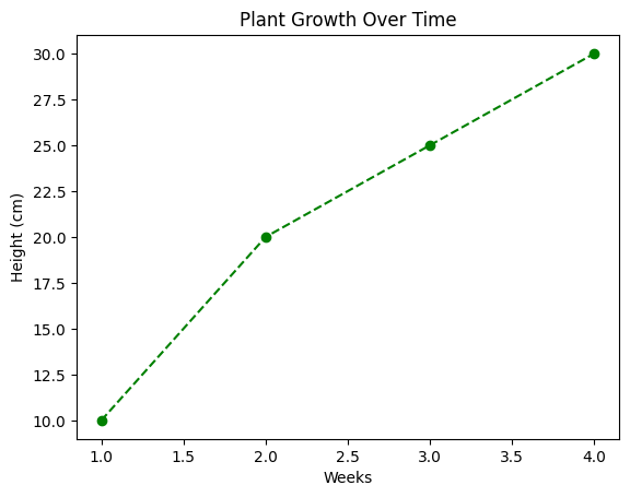
Adding Titles and Labels
    plt.plot(weeks, height)
    plt.title("Plant Growth Over Time")
    plt.xlabel("Weeks")
    plt.ylabel("Height (cm)")
    plt.show()
Changing Line Style and Color
You can customize the line’s appearance with parameters like:
- Color: Use the
colorparameter (e.g.,color="red"). - Line Style: Use the
linestyleparameter (e.g.,linestyle="--"for dashed lines). - Markers: Use the
markerparameter (e.g.,marker="o"for circles).
    plt.plot(weeks, height, color="green", linestyle="--", marker="o")
    plt.title("Plant Growth Over Time")
    plt.xlabel("Weeks")
    plt.ylabel("Height (cm)")
    plt.show()

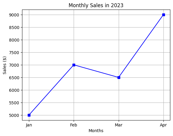
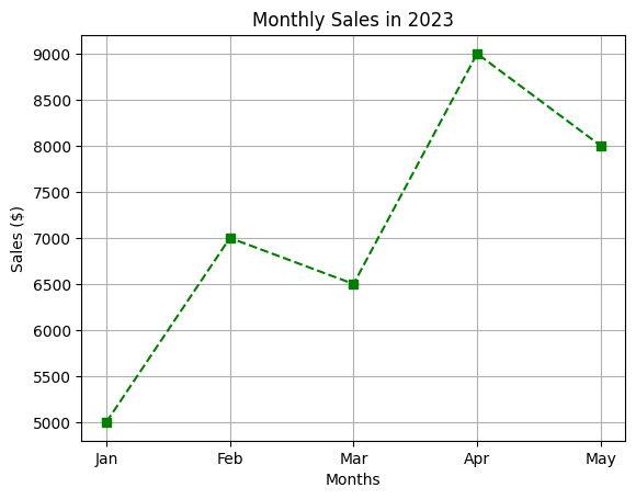
Real-World Example: Tracking Monthly Sales
Let’s say you’re a business owner tracking monthly sales for the first four months of the year. Here’s how you can visualize it:
    # Data
    months = ["Jan", "Feb", "Mar", "Apr"]
    sales = [5000, 7000, 6500, 9000]  # Sales in dollars

    # Create a line plot
    plt.plot(months, sales, color="blue", marker="s", linestyle="-")
    plt.title("Monthly Sales in 2023")
    plt.xlabel("Months")
    plt.ylabel("Sales ($)")
    plt.grid(True)  # Add a grid for better readability
    plt.show()
Common Mistakes to Avoid
- Forgetting
plt.show(): Without it, your plot won’t display. - Mixing Up X and Y Data: Always ensure your X and Y data are in the correct order.
- Overloading the Plot: Avoid adding too much information to a single plot. Keep it simple and clear.
Practice Exercise
Let’s put your new skills to the test! Here’s a small task for you:
    # Data
    days = ["Mon", "Tue", "Wed", "Thu", "Fri", "Sat", "Sun"]
    visitors = [200, 300, 250, 400, 350, 500, 450]

    # Create a plot
    plt.plot(days, visitors)
    plt.title("Website Visitors Over a Week")
    plt.xlabel("Days")
    plt.ylabel("Visitors")
    plt.grid(True)
    plt.show()

Conclusion
You’ve just created your first line plot with Matplotlib! Here’s what you’ve learned:
- How to create a basic line plot.
- How to customize the plot with titles, labels, colors, and markers.
- How to avoid common mistakes.
Customizing Your Plots: Make Your Matplotlib Visualizations Stand Out
Now that you’ve created your first plot, it’s time to make it look professional and polished. In this guide, we’ll explore how to customize your plots by adding titles, labels, legends, and more. By the end of this guide, you’ll be able to create plots that are not only informative but also visually appealing. Let’s dive in!
Why Customize Your Plots?
- It makes your plots easier to understand.
- It helps you highlight key insights.
- It makes your plots look professional for presentations or reports.
Adding Titles and Labels
A good plot always has a title and axis labels. These help the viewer understand what the plot is about.
Example: Adding a Title and Labels
    import matplotlib.pyplot as plt

    # Data
    weeks = [1, 2, 3, 4]  # Weeks
    height = [10, 20, 25, 30]  # Height in cm

    # Create a line plot
    plt.plot(weeks, height)

    # Add title and labels
    plt.title("Plant Growth Over Time")
    plt.xlabel("Weeks")
    plt.ylabel("Height (cm)")

    # Display the plot
    plt.show()

Changing Colors and Styles
Customizing the color, line style, and markers can make your plot more visually appealing and easier to interpret.
Example: Customizing Line Color and Style
    plt.plot(weeks, height, color="green", linestyle="--", marker="o")
    plt.title("Plant Growth Over Time")
    plt.xlabel("Weeks")
    plt.ylabel("Height (cm)")
    plt.show()
Customization Options
- Colors: Use the
colorparameter (e.g.,color="red"). - Line Styles: Use the
linestyleparameter:- "-" (solid line)
- "--" (dashed line)
- ":" (dotted line)
- Markers: Use the
markerparameter:- "o" (circle)
- "s" (square)
- "^" (triangle)
Adding Legends
A legend helps identify different lines or data series in a plot. It’s especially useful when you have multiple lines on the same plot.
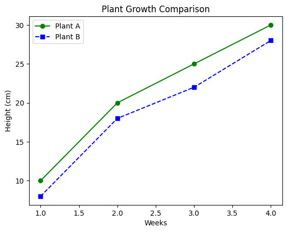
Example: Adding a Legend
    # Data
    weeks = [1, 2, 3, 4]
    plant1_height = [10, 20, 25, 30]
    plant2_height = [8, 18, 22, 28]

    # Create plots
    plt.plot(weeks, plant1_height, label="Plant A", color="green", linestyle="-", marker="o")
    plt.plot(weeks, plant2_height, label="Plant B", color="blue", linestyle="--", marker="s")

    # Add title, labels, and legend
    plt.title("Plant Growth Comparison")
    plt.xlabel("Weeks")
    plt.ylabel("Height (cm)")
    plt.legend()

    # Display the plot
    plt.show()
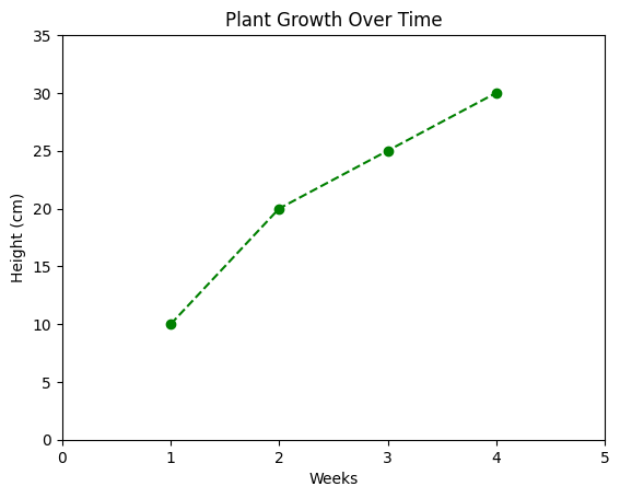
Setting Axis Limits
Sometimes, you may want to zoom in or zoom out of your plot by setting custom axis limits.
Example: Setting Axis Limits
    plt.plot(weeks, height, color="green", linestyle="--", marker="o")
    plt.title("Plant Growth Over Time")
    plt.xlabel("Weeks")
    plt.ylabel("Height (cm)")
    plt.xlim(0, 5)  # Set X-axis limits
    plt.ylim(0, 35)  # Set Y-axis limits
    plt.show()
Common Mistakes to Avoid
- Overloading the Plot: Avoid adding too many customizations at once. Keep it simple and clean.
- Forgetting the Legend: If you have multiple lines, always add a legend.
- Ignoring Axis Limits: Use
plt.xlim()andplt.ylim()to focus on the relevant part of the data.
Practice Exercise
Let’s put your new skills to the test! Here’s a small task for you:
    # Data
    days = ["Mon", "Tue", "Wed", "Thu", "Fri", "Sat", "Sun"]
    temperature = [25, 27, 26, 28, 30, 29, 31]

    # Create a plot
    plt.plot(days, temperature, color="red", marker="o")
    plt.title("City Temperature Over a Week")
    plt.xlabel("Days")
    plt.ylabel("Temperature (°C)")
    plt.ylim(20, 35)  # Set Y-axis limits
    plt.show()

Conclusion
You’ve just learned how to customize your Matplotlib plots like a pro! Here’s what you’ve covered:
- Adding titles and labels.
- Changing colors, line styles, and markers.
- Adding legends to identify multiple lines.
- Setting axis limits to focus on specific data ranges.
In the next guide, we’ll explore different types of plots, such as scatter plots and bar plots. Stay tuned!
Different Types of Plots in Matplotlib: Visualize Your Data Like a Pro
Now that you’ve mastered line plots and customizations, it’s time to explore other types of plots that Matplotlib offers. Each type of plot is suited for different kinds of data and insights. In this guide, we’ll cover scatter plots, bar plots, histograms, and pie charts, with real-world examples to help you understand when and how to use them. Let’s dive in!
1. Scatter Plot
A scatter plot is used to show the relationship between two variables. It’s perfect for identifying trends, correlations, or outliers in your data.
When to Use a Scatter Plot
- To visualize the relationship between two numerical variables.
- To identify patterns or clusters in data.
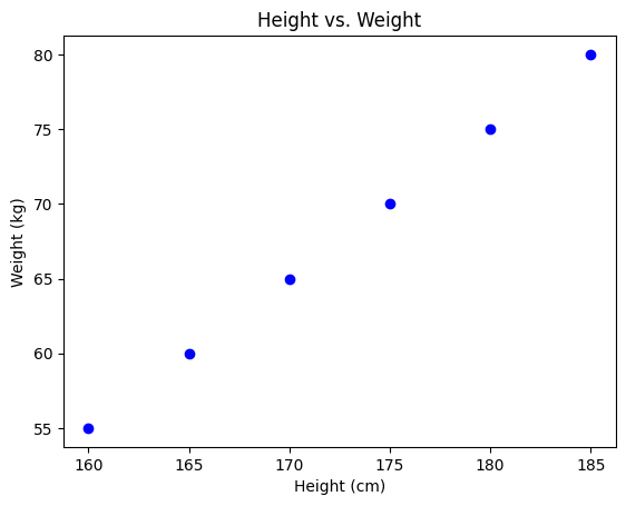
Example 1: Height vs. Weight
    import matplotlib.pyplot as plt

    # Data
    height = [160, 165, 170, 175, 180, 185]
    weight = [55, 60, 65, 70, 75, 80]

    # Create a scatter plot
    plt.scatter(height, weight, color="blue", marker="o")

    # Add title and labels
    plt.title("Height vs. Weight")
    plt.xlabel("Height (cm)")
    plt.ylabel("Weight (kg)")

    # Display the plot
    plt.show()
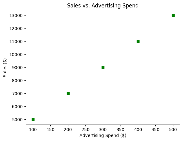
Example 2: Sales vs. Advertising Spend
    # Data
    advertising = [100, 200, 300, 400, 500]
    sales = [5000, 7000, 9000, 11000, 13000]

    # Create a scatter plot
    plt.scatter(advertising, sales, color="green", marker="s")

    # Add title and labels
    plt.title("Sales vs. Advertising Spend")
    plt.xlabel("Advertising Spend ($)")
    plt.ylabel("Sales ($)")

    # Display the plot
    plt.show()
2. Bar Plot
A bar plot is great for comparing categories or groups. It uses rectangular bars to represent data, where the length of the bar corresponds to the value.
When to Use a Bar Plot
- To compare quantities across different categories.
- To show trends over time (if categories are time-based).
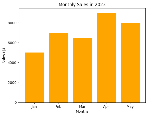
Example 1: Monthly Sales
    # Data
    months = ["Jan", "Feb", "Mar", "Apr", "May"]
    sales = [5000, 7000, 6500, 9000, 8000]

    # Create a bar plot
    plt.bar(months, sales, color="orange")

    # Add title and labels
    plt.title("Monthly Sales in 2023")
    plt.xlabel("Months")
    plt.ylabel("Sales ($)")

    # Display the plot
    plt.show()
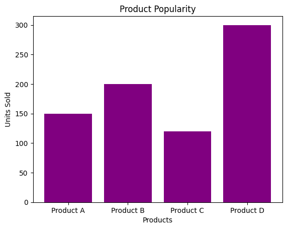
Example 2: Product Popularity
    # Data
    products = ["Product A", "Product B", "Product C", "Product D"]
    popularity = [150, 200, 120, 300]

    # Create a bar plot
    plt.bar(products, popularity, color="purple")

    # Add title and labels
    plt.title("Product Popularity")
    plt.xlabel("Products")
    plt.ylabel("Units Sold")

    # Display the plot
    plt.show()
3. Histogram
A histogram is used to show the distribution of a dataset. It divides the data into bins and displays the frequency of data points in each bin.
Example 1: Age Distribution
    import matplotlib.pyplot as plt

    # Data
    ages = [22, 25, 27, 30, 32, 35, 40, 45, 50, 55, 60, 65, 70]

    # Create a histogram
    plt.hist(ages, bins=5, color="teal", edgecolor="black")

    # Add title and labels
    plt.title("Age Distribution")
    plt.xlabel("Age")
    plt.ylabel("Frequency")

    # Display the plot
    plt.show()

4. Pie Chart
A pie chart is used to show proportions or percentages of a whole. It’s great for visualizing how different categories contribute to the total.
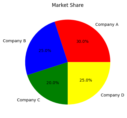
Example 1: Market Share
    # Data
    companies = ["Company A", "Company B", "Company C", "Company D"]
    market_share = [30, 25, 20, 25]

    # Create a pie chart
    plt.pie(market_share, labels=companies, autopct="%1.1f%%", colors=["red", "blue", "green", "yellow"])

    # Add title
    plt.title("Market Share")

    # Display the plot
    plt.show()
Working with Multiple Plots in Matplotlib: Organize Your Visualizations Like a Pro
Sometimes, a single plot isn’t enough to tell the whole story. That’s where multiple plots come in! With Matplotlib, you can create subplots—multiple plots arranged in a grid within a single figure. This is incredibly useful when you want to compare different datasets or visualize multiple aspects of your data side by side. In this guide, we’ll explore how to create subplots and adjust figure size to make your visualizations more effective. Let’s get started!
Why Use Multiple Plots?
- Compare Data: Visualize multiple datasets or variables side by side.
- Save Space: Display multiple plots in a single figure instead of creating separate ones.
- Tell a Story: Use multiple plots to show different perspectives of the same data.
Creating Subplots
Subplots are created using the plt.subplots() function. This function returns a figure object and an array of axes objects, which you can use to create individual plots.
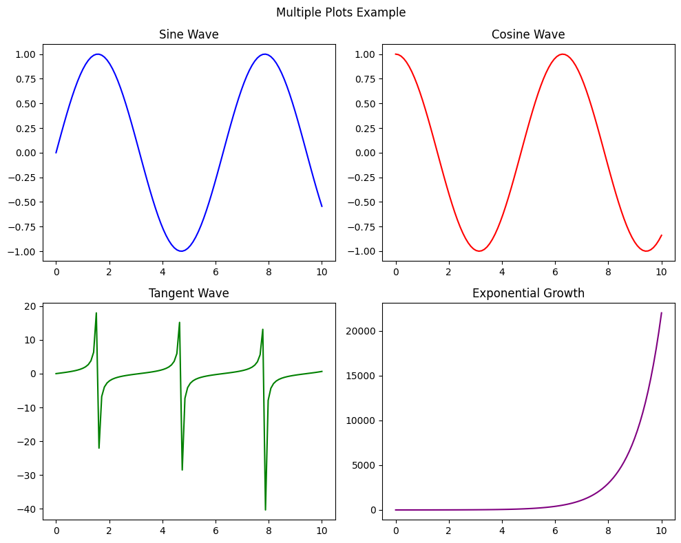
Example 1: Basic Subplots
    import matplotlib.pyplot as plt
    import numpy as np

    # Data
    x = np.linspace(0, 10, 100)
    y1 = np.sin(x)
    y2 = np.cos(x)
    y3 = np.tan(x)
    y4 = np.exp(x)

    # Create a 2x2 grid of subplots
    fig, ax = plt.subplots(2, 2, figsize=(10, 8))

    # Plot in the first subplot
    ax[0, 0].plot(x, y1, color="blue")
    ax[0, 0].set_title("Sine Wave")

    # Plot in the second subplot
    ax[0, 1].plot(x, y2, color="red")
    ax[0, 1].set_title("Cosine Wave")

    # Plot in the third subplot
    ax[1, 0].plot(x, y3, color="green")
    ax[1, 0].set_title("Tangent Wave")

    # Plot in the fourth subplot
    ax[1, 1].plot(x, y4, color="purple")
    ax[1, 1].set_title("Exponential Growth")

    # Add a common title
    fig.suptitle("Multiple Plots Example")

    # Display the plot
    plt.tight_layout()
    plt.show()
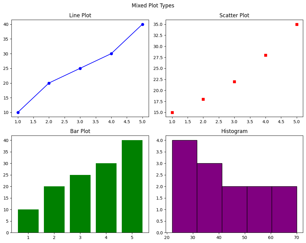
Example 2: Mixed Plot Types
    # Data
    x = [1, 2, 3, 4, 5]
    y1 = [10, 20, 25, 30, 40]
    y2 = [15, 18, 22, 28, 35]
    data = [22, 25, 27, 30, 32, 35, 40, 45, 50, 55, 60, 65, 70]

    # Create a 2x2 grid of subplots
    fig, ax = plt.subplots(2, 2, figsize=(10, 8))

    # Line plot
    ax[0, 0].plot(x, y1, color="blue", marker="o")
    ax[0, 0].set_title("Line Plot")

    # Scatter plot
    ax[0, 1].scatter(x, y2, color="red", marker="s")
    ax[0, 1].set_title("Scatter Plot")

    # Bar plot
    ax[1, 0].bar(x, y1, color="green")
    ax[1, 0].set_title("Bar Plot")

    # Histogram
    ax[1, 1].hist(data, bins=5, color="purple", edgecolor="black")
    ax[1, 1].set_title("Histogram")

    # Add a common title
    fig.suptitle("Mixed Plot Types")

    # Display the plot
    plt.tight_layout()
    plt.show()
Adjusting Figure Size
Sometimes, your plots may feel cramped or too small. You can adjust the figure size using the figsize parameter in
plt.subplots() or plt.figure().
Example: Custom Figure Size
    # Create a 1x2 grid of subplots with custom size
    fig, ax = plt.subplots(1, 2, figsize=(12, 5))

    # Plot in the first subplot
    ax[0].plot(x, y1, color="blue")
    ax[0].set_title("Line Plot")

    # Plot in the second subplot
    ax[1].scatter(x, y2, color="red")
    ax[1].set_title("Scatter Plot")

    # Add a common title
    fig.suptitle("Custom Figure Size Example")

    # Display the plot
    plt.tight_layout()
    plt.show()

Common Mistakes to Avoid
- Overcrowding Subplots: Avoid adding too many subplots in a single figure. Keep it clean and readable.
- Forgetting Titles and Labels: Always add titles and labels to your subplots.
- Ignoring
plt.tight_layout(): Use this function to avoid overlapping subplots.
Practice Exercise
Let’s put your new skills to the test! Here’s a small task for you:
    # Data
    days = ["Mon", "Tue", "Wed", "Thu", "Fri", "Sat", "Sun"]
    temperature = [25, 27, 26, 28, 30, 29, 31]
    rainfall = [10, 5, 0, 15, 20, 10, 5]

    # Create a 2x1 grid of subplots
    fig, ax = plt.subplots(2, 1, figsize=(10, 6))

    # Temperature plot
    ax[0].plot(days, temperature, color="red", marker="o")
    ax[0].set_title("Temperature Over a Week")

    # Rainfall plot
    ax[1].bar(days, rainfall, color="blue")
    ax[1].set_title("Rainfall Over a Week")

    # Add a common title
    fig.suptitle("Weather Analysis")

    # Display the plot
    plt.tight_layout()
    plt.show()

Advanced Customization in Matplotlib: Make Your Plots Shine
Now that you’ve mastered the basics of Matplotlib, it’s time to take your plots to the next level with advanced customization. In this guide, we’ll explore how to add annotations, grids, and custom ticks and labels to make your plots more informative and visually appealing. Whether you’re highlighting key insights or fine-tuning the appearance of your plots, these techniques will help you create professional-quality visualizations. Let’s get started!
1. Annotations
Annotations are used to highlight specific points or add explanatory text to your plots. They can include text, arrows, or both.
When to Use Annotations
- To highlight important data points (e.g., peaks, outliers).
- To explain trends or patterns in your data.
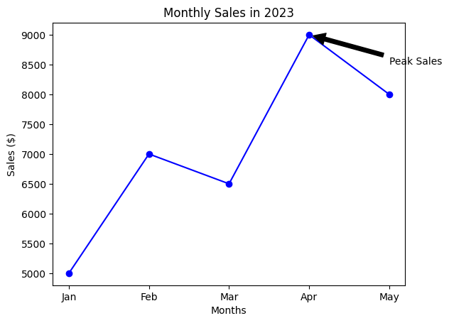
Example 1: Highlighting a Peak
    import matplotlib.pyplot as plt

    # Data
    months = ["Jan", "Feb", "Mar", "Apr", "May"]
    sales = [5000, 7000, 6500, 9000, 8000]

    # Create a line plot
    plt.plot(months, sales, color="blue", marker="o")

    # Add an annotation
    plt.annotate("Peak Sales", xy=(3, 9000), xytext=(4, 8500),
                 arrowprops=dict(facecolor="black", shrink=0.05))

    # Add title and labels
    plt.title("Monthly Sales in 2023")
    plt.xlabel("Months")
    plt.ylabel("Sales ($)")

    # Display the plot
    plt.show()
Example 2: Explaining a Trend
    # Data
    days = ["Mon", "Tue", "Wed", "Thu", "Fri", "Sat", "Sun"]
    temperature = [25, 27, 26, 28, 30, 29, 31]

    # Create a line plot
    plt.plot(days, temperature, color="red", marker="o")

    # Add an annotation
    plt.annotate("Rainy Day", xy=(4, 30), xytext=(5, 28),
                 arrowprops=dict(facecolor="black", shrink=0.05))

    # Add title and labels
    plt.title("Daily Temperature in July")
    plt.xlabel("Day")
    plt.ylabel("Temperature (°C)")

    # Display the plot
    plt.show()

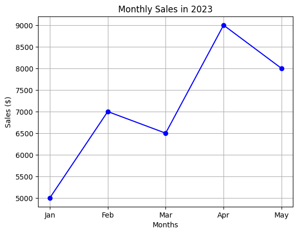
2. Grids
Grids are horizontal and vertical lines that make it easier to read and interpret your plots. They’re especially useful for identifying trends and comparing values.
Example: Adding a Grid
    plt.plot(months, sales, color="blue", marker="o")
    plt.title("Monthly Sales in 2023")
    plt.xlabel("Months")
    plt.ylabel("Sales ($)")
    plt.grid(True)  # Add a grid
    plt.show()
3. Customizing Ticks and Labels
Ticks are the small marks on the axes, and labels are the text that describes them. Customizing ticks and labels can make your plots more informative and aesthetically pleasing.
Example 1: Custom X-axis Ticks
    plt.plot(months, sales, color="blue", marker="o")
    plt.title("Monthly Sales in 2023")
    plt.xlabel("Months")
    plt.ylabel("Sales ($)")

    # Customize X-axis ticks
    plt.xticks([0, 1, 2, 3, 4], ["Jan", "Feb", "Mar", "Apr", "May"])

    # Display the plot
    plt.show()

Example 2: Custom Y-axis Ticks
    plt.plot(days, temperature, color="red", marker="o")
    plt.title("Daily Temperature in July")
    plt.xlabel("Day")
    plt.ylabel("Temperature (°C)")

    # Customize Y-axis ticks
    plt.yticks([25, 27, 29, 31], ["Cool", "Warm", "Hot", "Very Hot"])

    # Display the plot
    plt.show()

Common Mistakes to Avoid
- Overloading Annotations: Avoid adding too many annotations, as they can clutter the plot.
- Ignoring Grids: Always add grids to improve readability.
- Inconsistent Ticks: Ensure your ticks and labels are consistent and easy to understand.
Practice Exercise
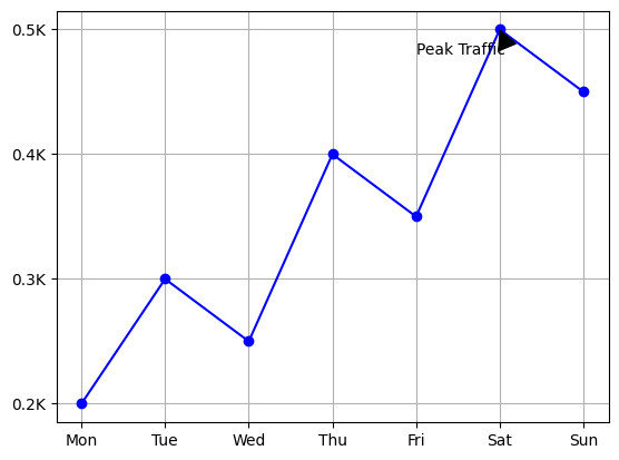
Let’s put your new skills to the test! Here’s a small task for you:
    # Data
    days = ["Mon", "Tue", "Wed", "Thu", "Fri", "Sat", "Sun"]
    visitors = [200, 300, 250, 400, 350, 500, 450]

    # Create a plot
    plt.plot(days, visitors, color="blue", marker="o")

    # Add an annotation
    plt.annotate("Peak Traffic", xy=(5, 500), xytext=(4, 480),
                 arrowprops=dict(facecolor="black", shrink=0.05))

    # Add a grid
    plt.grid(True)

    # Customize Y-axis ticks
    plt.yticks([200, 300, 400, 500], ["0.2K", "0.3K", "0.4K", "0.5K"])

    # Display the plot
    plt.show()
Saving Your Plots in Matplotlib: Share Your Visualizations with the World
Once you’ve created a stunning plot, the next step is to save it so you can share it with others or use it in reports, presentations, or publications. Matplotlib makes it incredibly easy to save your plots as image files in various formats, such as PNG, JPEG, SVG, and PDF. In this guide, we’ll explore how to save your plots and customize the output for high-quality results. Let’s get started!
Why Save Your Plots?
- Share Insights: Save plots to share with colleagues, clients, or stakeholders.
- Use in Reports: Embed plots in documents, presentations, or dashboards.
- Archive Data: Save visualizations for future reference or analysis.
How to Save Your Plots
Matplotlib provides the plt.savefig() function to save your plots. You can specify the file name, file format, and resolution (DPI).
Basic Example: Saving a Plot as PNG
    import matplotlib.pyplot as plt

    # Data
    months = ["Jan", "Feb", "Mar", "Apr", "May"]
    sales = [5000, 7000, 6500, 9000, 8000]

    # Create a line plot
    plt.plot(months, sales, color="blue", marker="o")

    # Add title and labels
    plt.title("Monthly Sales in 2023")
    plt.xlabel("Months")
    plt.ylabel("Sales ($)")

    # Save the plot
    plt.savefig("monthly_sales.png", dpi=300)  # Save as PNG with high resolution

    # Display the plot (optional)
    plt.show()

Supported File Formats
Matplotlib supports a variety of file formats. Here are some common ones:
- PNG: High-quality raster format (good for web and documents).
- JPEG: Compressed raster format (good for photos).
- SVG: Scalable vector format (good for web and editing).
- PDF: Vector format (good for printing and documents).
Example: Saving in Different Formats
    # Save as PNG
    plt.savefig("monthly_sales.png", dpi=300)

    # Save as JPEG
    plt.savefig("monthly_sales.jpg", dpi=300)

    # Save as SVG
    plt.savefig("monthly_sales.svg")

    # Save as PDF
    plt.savefig("monthly_sales.pdf")
Customizing the Output
You can customize the saved plot by adjusting parameters like size, transparency, and background color.
Example: Customizing the Saved Plot
import matplotlib.pyplot as plt

# Data
months = ["Jan", "Feb", "Mar", "Apr", "May"]
sales = [5000, 7000, 6500, 9000, 8000]

# Create a figure with the desired size
plt.figure(figsize=(8, 4)) # Set figure size before creating the plot


# Create a plot
plt.plot(months, sales, color="blue", marker="o")
plt.title("Monthly Sales in 2023")
plt.xlabel("Months")
plt.ylabel("Sales ($)")

# Save with custom settings (figsize is removed here)
plt.savefig("monthly_sales_custom.png", dpi=300, transparent=True, bbox_inches="tight")
Real-World Example: Saving a Report-Ready Plot
Imagine you’re creating a sales report and need to save a plot for inclusion in a PDF document. Here’s how you can do it:
    # Data
    months = ["Jan", "Feb", "Mar", "Apr", "May"]
    sales = [5000, 7000, 6500, 9000, 8000]

    # Create a plot
    plt.plot(months, sales, color="green", marker="s", linestyle="--")
    plt.title("Monthly Sales in 2023")
    plt.xlabel("Months")
    plt.ylabel("Sales ($)")
    plt.grid(True)

    # Save as a high-quality PDF
    plt.savefig("sales_report.pdf", dpi=300, bbox_inches="tight")

    # Display the plot (optional)
    plt.show()
Common Mistakes to Avoid
- Forgetting
plt.savefig(): Always callplt.savefig()beforeplt.show(), asplt.show()clears the figure. - Low Resolution: Use a high DPI (e.g., 300) for print-quality images.
- Extra Whitespace: Use
bbox_inches="tight"to remove unnecessary whitespace.
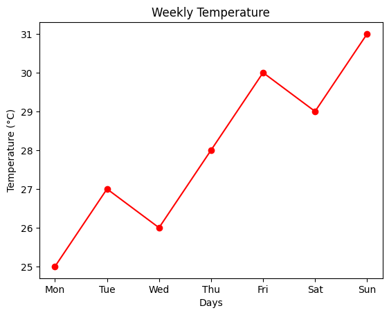
Practice Exercise
Let’s put your new skills to the test! Here’s a small task for you:
    # Data
    days = ["Mon", "Tue", "Wed", "Thu", "Fri", "Sat", "Sun"]
    temperature = [25, 27, 26, 28, 30, 29, 31]

    # Create a plot
    plt.plot(days, temperature, color="red", marker="o")
    plt.title("Weekly Temperature")
    plt.xlabel("Days")
    plt.ylabel("Temperature (°C)")

    # Save as high-resolution PNG
    plt.savefig("weekly_temperature.png", dpi=300)

    # Display the plot
    plt.show()
Advanced Plot Types in Matplotlib: Visualize Complex Data Like a Pro
While basic plots like line plots and bar plots are great for many scenarios, sometimes you need more advanced visualizations to uncover deeper insights in your data. In this guide, we’ll explore advanced plot types in Matplotlib, including box plots, violin plots, error bars, and stack plots. These plots are perfect for analyzing distributions, uncertainties, and cumulative data. Let’s dive in!
1. Box Plot
A box plot (or whisker plot) is used to show the distribution of a dataset and identify outliers. It displays the median, quartiles, and potential outliers in a compact and easy-to-read format.
Example: Comparing Exam Scores
    import matplotlib.pyplot as plt
    import numpy as np

    # Data
    np.random.seed(42)
    class_a = np.random.normal(70, 10, 50)
    class_b = np.random.normal(80, 8, 50)
    class_c = np.random.normal(60, 12, 50)
    data = [class_a, class_b, class_c]

    # Create a box plot
    plt.boxplot(data, labels=["Class A", "Class B", "Class C"])

    # Add title and labels
    plt.title("Exam Scores by Class")
    plt.xlabel("Class")
    plt.ylabel("Scores")

    # Display the plot
    plt.show()

2. Violin Plot
A violin plot combines a box plot with a kernel density estimate (KDE). It shows the distribution of the data and its probability density.
Example: Comparing Heights
    # Data
    region_1 = np.random.normal(170, 10, 100)
    region_2 = np.random.normal(160, 8, 100)
    data = [region_1, region_2]

    # Create a violin plot
    plt.violinplot(data, showmedians=True)

    # Add labels and title
    plt.xticks([1, 2], ["Region 1", "Region 2"])
    plt.title("Height Distribution by Region")
    plt.xlabel("Region")
    plt.ylabel("Height (cm)")

    # Display the plot
    plt.show()

3. Error Bars
Error bars are used to show the uncertainty or variability in your data. They’re often added to line plots or bar plots.
Example: Temperature Measurements
    # Data
    days = ["Mon", "Tue", "Wed", "Thu", "Fri", "Sat", "Sun"]
    temperature = [25, 27, 26, 28, 30, 29, 31]
    error = [1, 0.8, 1.2, 0.9, 1.1, 1.0, 0.7]

    # Create a line plot with error bars
    plt.errorbar(days, temperature, yerr=error, fmt="o-", capsize=5, color="blue")

    # Add title and labels
    plt.title("Weekly Temperature with Error Bars")
    plt.xlabel("Day")
    plt.ylabel("Temperature (°C)")

    # Display the plot
    plt.show()

4. Stack Plot
A stack plot is used to show cumulative data over time. It’s great for visualizing how different components contribute to the whole.
Example: Monthly Sales by Product
    # Data
    months = ["Jan", "Feb", "Mar", "Apr", "May", "Jun", "Jul", "Aug", "Sep", "Oct", "Nov", "Dec"]
    product_a = [2000, 2200, 2500, 2300, 2400, 2600, 2700, 2800, 2900, 3000, 3100, 3200]
    product_b = [1500, 1600, 1700, 1800, 1900, 2000, 2100, 2200, 2300, 2400, 2500, 2600]
    product_c = [1000, 1100, 1200, 1300, 1400, 1500, 1600, 1700, 1800, 1900, 2000, 2100]

    # Create a stack plot
    plt.stackplot(months, product_a, product_b, product_c, labels=["Product A", "Product B", "Product C"])

    # Add title and labels
    plt.title("Monthly Sales by Product")
    plt.xlabel("Months")
    plt.ylabel("Sales ($)")

    # Add a legend
    plt.legend(loc="upper left")

    # Display the plot
    plt.show()

Common Mistakes to Avoid
- Misinterpreting Box Plots: Remember that the box represents the IQR, and the whiskers show the range of the data (excluding outliers).
- Overloading Stack Plots: Avoid using too many categories in a stack plot, as it can become hard to read.
- Ignoring Error Bars: Always include error bars when showing variability or uncertainty in your data.
Practice Exercise
Let’s put your new skills to the test! Here’s a small task for you:
    # Data
    school_a = np.random.normal(70, 10, 100)
    school_b = np.random.normal(80, 8, 100)

    # Create a violin plot
    plt.violinplot([school_a, school_b], showmedians=True)

    # Add labels
    plt.xticks([1, 2], ["School A", "School B"])
    plt.title("Exam Scores by School")
    plt.xlabel("School")
    plt.ylabel("Scores")

    # Display the plot
    plt.show()

3D Plotting in Matplotlib: Visualize Data in Three Dimensions
Sometimes, 2D plots just aren’t enough to capture the complexity of your data. That’s where 3D plotting comes in! With Matplotlib, you can create stunning 3D visualizations to explore relationships between three variables. In this guide, we’ll cover 3D line plots, 3D scatter plots, and surface plots, with real-world examples to help you get started. Let’s dive into the third dimension!
Why Use 3D Plots?
- Visualize Complex Data: Explore relationships between three variables.
- Identify Patterns: Spot trends, clusters, or anomalies in 3D space.
- Enhance Presentations: Create eye-catching visuals for reports or presentations.
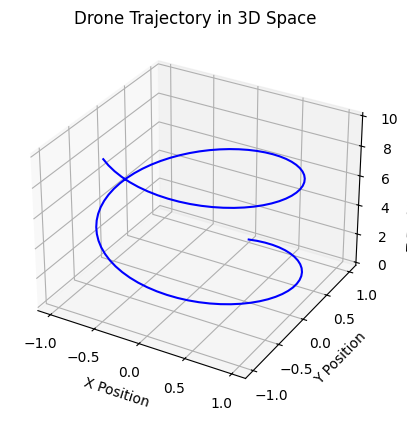
1. 3D Line Plot
A 3D line plot is used to visualize a path or trajectory in three-dimensional space. It’s perfect for showing how three variables change together over time.
Example: Visualizing a 3D Trajectory
    import matplotlib.pyplot as plt
    from mpl_toolkits.mplot3d import Axes3D
    import numpy as np

    # Data
    t = np.linspace(0, 10, 100)
    x = np.sin(t)
    y = np.cos(t)
    z = t

    # Create a 3D plot
    fig = plt.figure()
    ax = fig.add_subplot(111, projection="3d")

    # Plot the trajectory
    ax.plot(x, y, z, color="blue")

    # Add labels
    ax.set_xlabel("X Position")
    ax.set_ylabel("Y Position")
    ax.set_zlabel("Z Position (Altitude)")

    # Add a title
    plt.title("Drone Trajectory in 3D Space")

    # Display the plot
    plt.show()

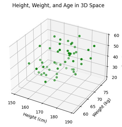
2. 3D Scatter Plot
A 3D scatter plot is used to visualize individual data points in three-dimensional space. It’s great for identifying clusters or patterns in your data.
Example: Visualizing 3D Data Points
    # Data
    np.random.seed(42)
    n = 50
    height = np.random.normal(170, 10, n)
    weight = np.random.normal(70, 5, n)
    age = np.random.randint(20, 60, n)

    # Create a 3D plot
    fig = plt.figure()
    ax = fig.add_subplot(111, projection="3d")

    # Plot the data points
    ax.scatter(height, weight, age, color="green", marker="o")

    # Add labels
    ax.set_xlabel("Height (cm)")
    ax.set_ylabel("Weight (kg)")
    ax.set_zlabel("Age (years)")

    # Add a title
    plt.title("Height, Weight, and Age in 3D Space")

    # Display the plot
    plt.show()
3. Surface Plot
A surface plot is used to visualize a 2D function in three dimensions. It’s perfect for showing how one variable depends on two others.
Example: Visualizing a 3D Surface
    # Data
    x = np.linspace(-5, 5, 100)
    y = np.linspace(-5, 5, 100)
    X, Y = np.meshgrid(x, y)
    Z = np.sin(np.sqrt(X**2 + Y**2))

    # Create a 3D plot
    fig = plt.figure()
    ax = fig.add_subplot(111, projection="3d")

    # Plot the surface
    ax.plot_surface(X, Y, Z, cmap="viridis")

    # Add labels
    ax.set_xlabel("X Coordinate")
    ax.set_ylabel("Y Coordinate")
    ax.set_zlabel("Temperature")

    # Add a title
    plt.title("Temperature Distribution in 3D Space")

    # Display the plot
    plt.show()

Common Mistakes to Avoid
- Overloading the Plot: Avoid adding too many data points or surfaces, as it can make the plot cluttered.
- Ignoring Labels: Always label your axes to make the plot easier to understand.
- Using the Wrong Plot Type: Choose the right type of 3D plot for your data (line, scatter, or surface).
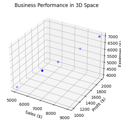
Practice Exercise
Let’s put your new skills to the test! Here’s a small task for you:
    # Data
    sales = [5000, 7000, 6500, 9000, 8000]
    profit = [1000, 1500, 1200, 2000, 1800]
    expenses = [4000, 5500, 5300, 7000, 6200]

    # Create a 3D scatter plot
    fig = plt.figure()
    ax = fig.add_subplot(111, projection="3d")

    # Plot the data points
    ax.scatter(sales, profit, expenses, color="blue", marker="o")

    # Add labels
    ax.set_xlabel("Sales ($)")
    ax.set_ylabel("Profit ($)")
    ax.set_zlabel("Expenses ($)")

    # Add a title
    plt.title("Business Performance in 3D Space")

    # Display the plot
    plt.show()
Animations in Matplotlib: Bring Your Data to Life
Static plots are great, but sometimes you need to show how data changes over time. That’s where animations come in! With Matplotlib, you can create dynamic, animated visualizations that bring your data to life. In this guide, we’ll explore how to create animations in Matplotlib, from basic line plots to more complex visualizations. Let’s get started!
Why Use Animations?
- Show Changes Over Time: Visualize how data evolves over time.
- Highlight Trends: Make trends and patterns more apparent.
- Engage Your Audience: Create eye-catching visuals for presentations or reports.
1. Basic Animation: A Moving Sine Wave
Let’s start with a simple example: animating a sine wave. This will help you understand the basics of creating animations in Matplotlib.
    import numpy as np
    import matplotlib.pyplot as plt
    from matplotlib.animation import FuncAnimation

    # Set up the figure and axis
    fig, ax = plt.subplots()
    x = np.linspace(0, 2 * np.pi, 100)
    line, = ax.plot(x, np.sin(x))

    # Animation function
    def animate(frame):
        line.set_ydata(np.sin(x + frame / 10))  # Update the sine wave
        return line,

    # Create the animation
    ani = FuncAnimation(fig, animate, frames=100, interval=50, blit=True)

    # Display the animation
    plt.show()
2. Real-World Example: Animated Stock Prices
Imagine you’re analyzing stock prices over time. Here’s how you can create an animation to show how the prices change:
    import numpy as np
    import matplotlib.pyplot as plt
    from matplotlib.animation import FuncAnimation

    # Simulated stock price data
    np.random.seed(42)
    days = 100
    prices = np.cumsum(np.random.randn(days))

    # Set up the figure and axis
    fig, ax = plt.subplots()
    ax.set_xlim(0, days)
    ax.set_ylim(prices.min() - 5, prices.max() + 5)
    line, = ax.plot([], [], color="blue")

    # Initialization function
    def init():
        line.set_data([], [])
        return line,

    # Animation function
    def animate(frame):
        x = np.arange(frame)
        y = prices[:frame]
        line.set_data(x, y)
        return line,

    # Create the animation
    ani = FuncAnimation(fig, animate, frames=days, init_func=init, interval=50, blit=True)

    # Add labels and title
    plt.title("Animated Stock Prices")
    plt.xlabel("Days")
    plt.ylabel("Price ($)")

    # Display the animation
    plt.show()
3. Advanced Animation: Multiple Lines
You can also animate multiple lines in the same plot. For example, let’s animate the sine and cosine waves together:
    import numpy as np
    import matplotlib.pyplot as plt
    from matplotlib.animation import FuncAnimation

    # Set up the figure and axis
    fig, ax = plt.subplots()
    x = np.linspace(0, 2 * np.pi, 100)
    line1, = ax.plot(x, np.sin(x), color="blue", label="Sine Wave")
    line2, = ax.plot(x, np.cos(x), color="red", label="Cosine Wave")
    ax.legend()

    # Animation function
    def animate(frame):
        line1.set_ydata(np.sin(x + frame / 10))
        line2.set_ydata(np.cos(x + frame / 10))
        return line1, line2

    # Create the animation
    ani = FuncAnimation(fig, animate, frames=100, interval=50, blit=True)

    # Display the animation
    plt.show()
4. Saving Animations
Once you’ve created an animation, you can save it as a video file (e.g., MP4 or GIF) to share with others.
Example: Saving as an MP4
    # Save the animation as an MP4 file
    ani.save("sine_wave.mp4", writer="ffmpeg", fps=20)
Example: Saving as a GIF
    # Save the animation as a GIF
    ani.save("sine_wave.gif", writer="pillow", fps=20)
Common Mistakes to Avoid
- Too Many Frames: Avoid creating animations with too many frames, as they can become slow and unmanageable.
- Ignoring
blit=True: Useblit=Trueto optimize performance by only redrawing the parts that change. - Overloading the Plot: Keep your animations simple and focused on the key message.
Practice Exercise
Let’s put your new skills to the test! Here’s a small task for you:
    # Data
    days = np.arange(0, 30)
    height = 0.5 * days

    # Create a plot
    fig, ax = plt.subplots()
    line, = ax.plot(days, height, color="green")

    # Animation function
    def animate(frame):
        line.set_ydata(0.5 * days[:frame])
        return line,

    # Create the animation
    ani = FuncAnimation(fig, animate, frames=30, interval=100, blit=True)

    # Save the animation as a GIF
    ani.save("plant_growth.gif", writer="pillow", fps=10)

    # Display the animation
    plt.show()
Interactive Plots in Matplotlib: Engage Your Audience with Dynamic Visualizations
Static plots are great, but sometimes you need interactivity to explore data more deeply or create engaging presentations. With Matplotlib, you can create interactive plots that allow users to zoom, pan, hover, and even update data dynamically. In this guide, we’ll explore how to create interactive plots using Matplotlib and its extensions. Let’s dive in!
Why Use Interactive Plots?
- Explore Data: Allow users to zoom, pan, and hover over data points.
- Engage Your Audience: Create dynamic and interactive presentations.
- Update Data Dynamically: Visualize live or streaming data.
1. Basic Interactivity with plt.show()
Matplotlib’s default plt.show() function already provides some basic interactivity:
- 🔍 Zoom: Use the magnifying glass icon or scroll wheel.
- 🖐️ Pan: Use the hand icon or click and drag.
- 💾 Save: Use the save icon to export the plot.
Example: Basic Interactivity
    import matplotlib.pyplot as plt

    # Data
    x = [1, 2, 3, 4]
    y = [10, 20, 25, 30]

    # Create a plot
    plt.plot(x, y, color="blue", marker="o")

    # Add title and labels
    plt.title("Interactive Plot")
    plt.xlabel("X-axis")
    plt.ylabel("Y-axis")

    # Display the plot
    plt.show()
2. Adding Hover Annotations
Hover annotations allow users to see additional information when they hover over data points. This can be achieved using the mplcursors library.
Step 1: Install mplcursors
pip install mplcursors
Step 2: Add Hover Annotations
    import matplotlib.pyplot as plt
    import mplcursors

    # Data
    x = [1, 2, 3, 4]
    y = [10, 20, 25, 30]
    labels = ["Point A", "Point B", "Point C", "Point D"]

    # Create a scatter plot
    plt.scatter(x, y, color="blue")

    # Add hover annotations
    mplcursors.cursor(hover=True).connect(
        "add", lambda sel: sel.annotation.set_text(labels[sel.target.index])
    )

    # Add title and labels
    plt.title("Hover Annotations")
    plt.xlabel("X-axis")
    plt.ylabel("Y-axis")

    # Display the plot
    plt.show()
3. Interactive Widgets with matplotlib.widgets
Matplotlib provides a widgets module to add interactive elements like sliders, buttons, and checkboxes to your plots.
Example: Adding a Slider
    import numpy as np
    import matplotlib.pyplot as plt
    from matplotlib.widgets import Slider

    # Set up the plot
    fig, ax = plt.subplots()
    plt.subplots_adjust(bottom=0.25)

    # Initial data
    x = np.linspace(0, 2 * np.pi, 1000)
    frequency = 1.0
    line, = plt.plot(x, np.sin(frequency * x), color="blue")

    # Add a slider
    ax_slider = plt.axes([0.2, 0.1, 0.6, 0.03])
    slider = Slider(ax_slider, "Frequency", 0.1, 5.0, valinit=frequency)

    # Update function
    def update(val):
        frequency = slider.val
        line.set_ydata(np.sin(frequency * x))
        fig.canvas.draw_idle()

    # Connect the slider to the update function
    slider.on_changed(update)

    # Display the plot
    plt.show()
4. Real-Time Data Updates
You can also create real-time visualizations that update dynamically as new data arrives. This is useful for live data streams or simulations.
Example: Real-Time Sine Wave
    import numpy as np
    import matplotlib.pyplot as plt
    import matplotlib.animation as animation

    # Set up the plot
    fig, ax = plt.subplots()
    x = np.linspace(0, 2 * np.pi, 100)
    line, = ax.plot(x, np.sin(x), color="blue")

    # Animation function
    def animate(frame):
        line.set_ydata(np.sin(x + frame / 10))
        return line,

    # Create the animation
    ani = animation.FuncAnimation(fig, animate, frames=100, interval=50, blit=True)

    # Display the plot
    plt.show()
Common Mistakes to Avoid
- Overloading Interactivity: Avoid adding too many interactive elements, as they can make the plot confusing.
- Ignoring Performance: Real-time updates can be resource-intensive—optimize your code for performance.
- Forgetting Labels: Always label your axes and add a title, even in interactive plots.
Practice Exercise
Let’s put your new skills to the test! Here’s a small task for you:
    # Data
    cities = ["New York", "London", "Tokyo", "Mumbai"]
    population = [8419000, 8908081, 13929286, 12442373]
Best Practices for Data Visualization in Matplotlib: Create Effective and Professional Plots
Creating a plot is one thing, but creating a plot that effectively communicates your message is another. In this guide, we’ll explore best practices for data visualization in Matplotlib. Whether you’re a beginner or an experienced data scientist, these tips will help you create clear, informative, and visually appealing plots. Let’s dive in!
1. Choosing the Right Plot
The type of plot you choose can make or break your visualization. Here’s a quick guide to help you decide:
Line Plots
Use Case: Show trends over time or continuous data.
    plt.plot(months, sales, color="blue", marker="o")
    plt.title("Monthly Sales in 2023")
    plt.xlabel("Months")
    plt.ylabel("Sales ($)")
    plt.show()
Scatter Plots
Use Case: Show relationships between two variables.
    plt.scatter(height, weight, color="green", marker="o")
    plt.title("Height vs. Weight")
    plt.xlabel("Height (cm)")
    plt.ylabel("Weight (kg)")
    plt.show()
Bar Plots
Use Case: Compare categories or groups.
    plt.bar(products, sales, color="orange")
    plt.title("Product Sales")
    plt.xlabel("Products")
    plt.ylabel("Sales ($)")
    plt.show()
Histograms
Use Case: Show the distribution of a dataset.
    plt.hist(scores, bins=10, color="purple", edgecolor="black")
    plt.title("Exam Score Distribution")
    plt.xlabel("Scores")
    plt.ylabel("Frequency")
    plt.show()
Pie Charts
Use Case: Show proportions or percentages.
    plt.pie(market_share, labels=companies, autopct="%1.1f%%", colors=["red", "blue", "green", "yellow"])
    plt.title("Market Share")
    plt.show()
2. Color Choices
Colors play a crucial role in making your plots visually appealing and accessible. Here are some tips:
Use Colorblind-Friendly Palettes
    plt.scatter(x, y, c=z, cmap="viridis")
    plt.colorbar(label="Intensity")
    plt.show()
Avoid Overloading with Colors
Too many colors can make your plot confusing. Stick to a limited color palette and use shades of the same color for gradients.
3. Labeling
Labels are essential for making your plots understandable. Always include:
- Title: A clear and concise title that summarizes the plot.
- Axis Labels: Include units if applicable.
- Legends: Use legends to identify multiple data series.
4. Keep It Simple
Simplicity is key to effective data visualization. Here’s how to avoid clutter:
- Avoid Overloading the Plot: Focus on the key message and remove unnecessary elements.
- Use Grids Sparingly: Add grids only when necessary.
- Limit Annotations: Highlight only the most important points.
Real-World Example: Sales Report
Imagine you’re creating a sales report for your company. Here’s how you can apply these best practices:
    # Data
    months = ["Jan", "Feb", "Mar", "Apr", "May"]
    sales = [5000, 7000, 6500, 9000, 8000]
    profit = [1000, 1500, 1200, 2000, 1800]

    # Create a line plot
    plt.plot(months, sales, color="blue", marker="o", label="Sales")
    plt.plot(months, profit, color="green", marker="s", label="Profit")

    # Add title and labels
    plt.title("Monthly Sales and Profit in 2023")
    plt.xlabel("Months")
    plt.ylabel("Amount ($)")

    # Add a legend
    plt.legend()

    # Add a grid
    plt.grid(True)

    # Display the plot
    plt.show()
Common Mistakes to Avoid
- Choosing the Wrong Plot Type: Ensure the plot type matches the data and the message you want to convey.
- Ignoring Accessibility: Use colorblind-friendly palettes and ensure your plots are readable for everyone.
- Overloading the Plot: Keep it simple and focus on the key message.
Practice Exercise
Let’s put your new skills to the test! Here’s a small task for you:
    # Data
    products = ["Product A", "Product B", "Product C", "Product D"]
    popularity = [150, 200, 120, 300]

    # Create a bar plot
    plt.bar(products, popularity, color="skyblue")

    # Add title and labels
    plt.title("Product Popularity")
    plt.xlabel("Products")
    plt.ylabel("Units Sold")

    # Display the plot
    plt.show()
Real-World Examples of Data Visualization in Matplotlib: From Time Series to Machine Learning
Matplotlib isn’t just for creating basic plots—it’s a powerful tool for solving real-world problems. In this guide, we’ll explore how to use Matplotlib for time series analysis, geospatial data visualization, and machine learning visualizations. These examples will help you see how Matplotlib can be applied to real-world scenarios. Let’s dive in!
1. Time Series Data
Time series data is everywhere—stock prices, weather data, sales trends, and more. Visualizing time series data helps you identify trends, patterns, and anomalies.
Example: Plotting Stock Prices
    import matplotlib.pyplot as plt
    import pandas as pd
    import numpy as np

    # Simulated stock price data
    dates = pd.date_range("20230101", periods=365)
    prices = 100 + np.cumsum(np.random.randn(365))

    # Create a time series plot
    plt.figure(figsize=(10, 6))
    plt.plot(dates, prices, color="blue")

    # Add title and labels
    plt.title("Stock Prices Over Time (2023)")
    plt.xlabel("Date")
    plt.ylabel("Price ($)")

    # Add a grid
    plt.grid(True)

    # Display the plot
    plt.show()
2. Geospatial Data
Geospatial data involves locations on Earth, such as cities, countries, or geographic features. Matplotlib, combined with libraries like Basemap or Cartopy, can be used to plot data on maps.
Example: Plotting Cities on a Map
    from mpl_toolkits.basemap import Basemap
    import matplotlib.pyplot as plt

    # Data
    cities = {
        "New York": (40.7128, -74.0060, 8419000),
        "London": (51.5074, -0.1278, 8908081),
        "Tokyo": (35.6895, 139.6917, 13929286),
        "Mumbai": (19.0760, 72.8777, 12442373),
    }

    # Create a map
    plt.figure(figsize=(10, 6))
    m = Basemap(projection="merc", llcrnrlat=-60, urcrnrlat=85,
                 llcrnrlon=-180, urcrnrlon=180, resolution="c")
    m.drawcoastlines()
    m.drawcountries()

    # Plot cities
    for city, (lat, lon, pop) in cities.items():
        x, y = m(lon, lat)
        m.plot(x, y, "ro", markersize=np.sqrt(pop) / 1000)
        plt.text(x, y, city, fontsize=12, ha="right")

    # Add title
    plt.title("Population of Major Cities")

    # Display the plot
    plt.show()
3. Machine Learning Visualizations
Visualizations are crucial in machine learning for understanding data, evaluating models, and interpreting results.
Example: Visualizing Decision Boundaries
    import numpy as np
    import matplotlib.pyplot as plt
    from sklearn.datasets import make_moons
    from sklearn.svm import SVC

    # Generate synthetic data
    X, y = make_moons(n_samples=200, noise=0.2, random_state=42)

    # Train a Support Vector Machine (SVM) classifier
    model = SVC(kernel="linear")
    model.fit(X, y)

    # Create a mesh grid for plotting
    xx, yy = np.meshgrid(np.linspace(X[:, 0].min() - 1, X[:, 0].max() + 1, 100),
                         np.linspace(X[:, 1].min() - 1, X[:, 1].max() + 1, 100))
    Z = model.predict(np.c_[xx.ravel(), yy.ravel()])
    Z = Z.reshape(xx.shape)

    # Plot decision boundaries
    plt.figure(figsize=(10, 6))
    plt.contourf(xx, yy, Z, alpha=0.8, cmap="coolwarm")
    plt.scatter(X[:, 0], X[:, 1], c=y, cmap="coolwarm", edgecolors="k")

    # Add title and labels
    plt.title("Decision Boundaries of SVM Classifier")
    plt.xlabel("Feature 1")
    plt.ylabel("Feature 2")

    # Display the plot
    plt.show()
Common Mistakes to Avoid
- Overloading Time Series Plots: Avoid plotting too many time series in one plot, as it can become cluttered.
- Ignoring Map Projections: Choose the right map projection for geospatial data to avoid distortions.
- Misinterpreting Decision Boundaries: Ensure you understand the model’s decision boundaries before drawing conclusions.
Practice Exercise
Let’s put your new skills to the test! Here’s a small task for you:
    # Data
    import pandas as pd
    import numpy as np
    import matplotlib.pyplot as plt

    dates = pd.date_range("20231001", periods=31)
    temperature = np.random.normal(25, 5, 31)

    # Create a time series plot
    plt.plot(dates, temperature, color="red", marker="o")

    # Add title and labels
    plt.title("Daily Temperature in October")
    plt.xlabel("Date")
    plt.ylabel("Temperature (°C)")

    # Display the plot
    plt.show()
Matplotlib Cheat Sheet: Quick Reference for Common Commands
Matplotlib is a powerful library for creating visualizations in Python, but with so many functions and options, it’s easy to forget the basics. This cheat sheet provides a quick reference for the most common Matplotlib commands, so you can create stunning plots without constantly searching the documentation. Let’s dive in!
1. Basic Plots
Line Plot
Use Case: Show trends over time or continuous data.
    plt.plot([1, 2, 3, 4], [10, 20, 25, 30], color="blue", linestyle="-", marker="o")
    plt.show()
Scatter Plot
Use Case: Show relationships between two variables.
    plt.scatter([1, 2, 3, 4], [10, 20, 25, 30], color="red", marker="o")
    plt.show()
Bar Plot
Use Case: Compare categories or groups.
    plt.bar(["A", "B", "C", "D"], [10, 20, 25, 30], color="green")
    plt.show()
Histogram
Use Case: Show the distribution of a dataset.
    plt.hist([1, 2, 2, 3, 3, 3, 4, 4, 4, 4], bins=4, color="purple", edgecolor="black")
    plt.show()
2. Customizing Plots
Add a Title
plt.title("Monthly Sales in 2023")
Add Axis Labels
    plt.xlabel("Months")
    plt.ylabel("Sales ($)")
Add a Legend
    plt.plot([1, 2, 3, 4], [10, 20, 25, 30], label="Sales")
    plt.legend()
Add a Grid
plt.grid(True)
3. Saving Plots
plt.savefig("my_plot.png", dpi=300)
4. Advanced Plots
Box Plot
    plt.boxplot([[1, 2, 3, 4], [10, 20, 25, 30]])
    plt.show()
Violin Plot
    plt.violinplot([[1, 2, 3, 4], [10, 20, 25, 30]])
    plt.show()
Error Bars
    plt.errorbar([1, 2, 3, 4], [10, 20, 25, 30], yerr=[1, 2, 1, 3], fmt="o-", capsize=5)
    plt.show()
Stack Plot
    plt.stackplot([1, 2, 3, 4], [10, 20, 25, 30], [5, 10, 15, 20])
    plt.show()
5. Real-World Examples
Time Series Data
    plt.plot(dates, prices, color="blue")
    plt.title("Stock Prices Over Time")
    plt.xlabel("Date")
    plt.ylabel("Price ($)")
    plt.show()
Geospatial Data
    from mpl_toolkits.basemap import Basemap
    m = Basemap(projection="merc")
    m.drawcoastlines()
    m.plot(lon, lat, "ro")
    plt.show()
Machine Learning Visualizations
    plt.contourf(xx, yy, Z, alpha=0.8, cmap="coolwarm")
    plt.scatter(X[:, 0], X[:, 1], c=y, cmap="coolwarm", edgecolors="k")
    plt.show()
Practice Projects in Matplotlib: Apply Your Skills to Real-World Scenarios
Now that you’ve learned the basics and advanced features of Matplotlib, it’s time to put your skills to the test with practice projects. These projects will help you apply what you’ve learned to real-world datasets and scenarios. Let’s dive into three exciting projects: weather data visualization, sales data analysis, and machine learning results visualization.
1. Weather Data Visualization
Visualizing weather data helps you understand trends and patterns in temperature, rainfall, and other meteorological variables.
Project Goal
Create a time series plot to visualize the temperature and rainfall of a city over a month.
    import matplotlib.pyplot as plt
    import pandas as pd
    import numpy as np

    # Simulated weather data
    dates = pd.date_range("20231001", periods=31)
    temperature = np.random.normal(25, 5, 31)
    rainfall = np.random.exponential(5, 31)

    # Create a figure and axis
    fig, ax1 = plt.subplots(figsize=(10, 6))

    # Plot temperature
    ax1.plot(dates, temperature, color="red", label="Temperature (°C)")
    ax1.set_xlabel("Date")
    ax1.set_ylabel("Temperature (°C)")
    ax1.tick_params(axis="y", labelcolor="red")

    # Create a second y-axis for rainfall
    ax2 = ax1.twinx()
    ax2.bar(dates, rainfall, color="blue", alpha=0.5, label="Rainfall (mm)")
    ax2.set_ylabel("Rainfall (mm)")
    ax2.tick_params(axis="y", labelcolor="blue")

    # Add title and legend
    plt.title("Weather Data: Temperature and Rainfall (October 2023)")
    fig.legend(loc="upper left")

    # Display the plot
    plt.show()
2. Sales Data Analysis
Analyzing sales data helps businesses understand performance and make informed decisions.
Project Goal
Create a bar plot to compare the monthly sales of a business over a year.
    import matplotlib.pyplot as plt

    # Data
    months = ["Jan", "Feb", "Mar", "Apr", "May", "Jun",
              "Jul", "Aug", "Sep", "Oct", "Nov", "Dec"]
    sales = [5000, 7000, 6500, 9000, 8000, 7500,
             8500, 9500, 9200, 10000, 11000, 12000]

    # Create a bar plot
    plt.figure(figsize=(10, 6))
    plt.bar(months, sales, color="green")

    # Add title and labels
    plt.title("Monthly Sales in 2023")
    plt.xlabel("Months")
    plt.ylabel("Sales ($)")

    # Add a grid
    plt.grid(axis="y", linestyle="--", alpha=0.7)

    # Display the plot
    plt.show()
3. Machine Learning Results Visualization
Visualizing machine learning results helps you evaluate model performance and identify areas for improvement.
Project Goal
Create a line plot to visualize the accuracy and loss curves of a machine learning model during training.
    import matplotlib.pyplot as plt

    # Simulated training data
    epochs = range(1, 21)
    accuracy = [0.5, 0.6, 0.7, 0.75, 0.8, 0.82,
                0.85, 0.87, 0.89, 0.9, 0.91,
                0.92, 0.93, 0.94, 0.95, 0.96,
                0.97, 0.98, 0.99, 1.0]
    loss = [1.0, 0.8, 0.6, 0.5, 0.4, 0.35,
            0.3, 0.25, 0.2, 0.18, 0.16,
            0.14, 0.12, 0.1, 0.08, 0.06,
            0.05, 0.04, 0.03, 0.02]

    # Create a figure and axis
    fig, ax1 = plt.subplots(figsize=(10, 6))

    # Plot accuracy
    ax1.plot(epochs, accuracy, color="blue", label="Accuracy")
    ax1.set_xlabel("Epochs")
    ax1.set_ylabel("Accuracy")
    ax1.tick_params(axis="y", labelcolor="blue")

    # Create a second y-axis for loss
    ax2 = ax1.twinx()
    ax2.plot(epochs, loss, color="red", label="Loss")
    ax2.set_ylabel("Loss")
    ax2.tick_params(axis="y", labelcolor="red")

    # Add title and legend
    plt.title("Model Training: Accuracy and Loss Curves")
    fig.legend(loc="upper right")

    # Display the plot
    plt.show()
Common Mistakes to Avoid
- Overloading Plots: Avoid adding too much information to a single plot—keep it simple and focused.
- Ignoring Labels: Always label your axes and add a title to make your plots understandable.
- Using the Wrong Plot Type: Choose the right plot type for your data and the message you want to convey.